Can We Talk about the Pixel Phone's Design?
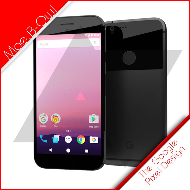
“The Pixel and Pixel XL looks like an iPhone clone.”
“Did Google take cues from Apple’s iPhone?”
“Did Google just out Apple, Apple!?”
“Google just made an iPhone…”
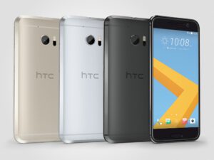 |
| We can see these similar chamfered edges from the HTC 10 on the Pixel phones |
First on our list is the HTC 10 phone, which I think is nearly half of the design choice.
We can see the phone has that slight chamfered edges that are rounded on the chamfer themselves.
This actually makes more sense seeing how the current rumor is that Google isn’t the one who actually manufactured it, HTC did…
It makes sense though, because the design language fits with HTC’s look and standards at the core, but then follows up with – what I believe – other notes from previous Nexus devices, such as from LG!
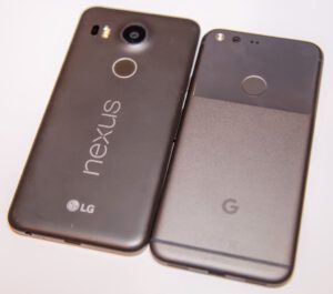 |
| Taking a look at the previous Nexus 5 from LG we can see similarities in designs. |
It could just be me, but again, I see more aspects from the previous Nexus device, more so (but not absent of) than the iPhone.
—-
At this point, you’re probably thinking: “Well what do you think it got from the iPhone!?”
That’s actually really simple. The notion for continuing to move forward with “premium” in mind, while not having a removable back nor expandable storage makes me think they’re trying to be a bit more apple-like… but that’s not all, while that’s the only physical design I think they took notes from Apple, the software is another field…
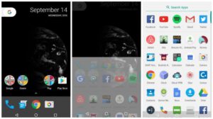 The Pixel Launcher (the interface in which android users use – because it’s changeable) reminds me a lot of the iPhone command center menu. While Apple took the concept from android’s notification shade, this is still – to me – a clear “give and take” between the two ecosystems.
But that’s essentially my personal take on it. It’s important to remember that all creations give and take to and fro from one another. It’s natural and is how we, in one way, progress with technological advances.
But seriously… why couldn’t we get a removable battery…


